

Choco - Latir Case Study
I designed a brand that holds its people close to it to share the love for chocolate and tradition. Choco-Latir is a brand that shares the flavor, culture and art of “La Madre Patria” Spain. With the use of illustration and packaging, we can get a share of Spain in every bite. Choco-Latir is fine artisan chocolate that is devoted to being as tasty as it is healthy. A delightful indulgence in a heavily Spaniard Art influenced package. I decided to showcase authentic traditions celebrated by Spanish people. Even though I am of Spanish descent, my family does not practice many of Spain’s traditions. For that reason, I decided to rely on my friend Iñaki and his family and friends to make a poll and create a list of the practices that they are most proud of, celebrate and would like to share with the World. The plan was lengthy, but the festivities very interesting.


About the Packaging System
Since 1896, Choco-Latir has been delivering rich, organic chocolate born from Spaniard traditional processes and methods to ensure that you get the best quality chocolate by selecting the best ingredients from around Spain and the World, honoring our Spaniard culture. We have traveled all of Spain looking for the best chocolate artisans that share our strong values; Production that is 100% made in Spain, respect for traditional methods, and human capital valorization. We work closely together to collaborate on unique recipes that are always delicious, exquisite, and sophisticated.
OVERVIEW: Love for chocolate is shared all around the World. But chocolate can be rich in flavor and textures and also in culture and ethical processes. In the US, few countries have succeeded in bringing their take on chocolate and sharing it with the American people. Choco-Latir not only wants to charm the hearts of the American consumer, but it also wants to share not only their chocolate but their culture and traditions with every bite they take.
SOLUTION: Intending to set the brand apart from its competitors like Godiva, Ghirardelli, Lindt, Ferrero Rocher that are international brands in the US, we want to, besides stand out from them for being artisan chocolates, also share more of our pride in Spain and our traditions, sharing our culture with the packaging and illustration.
Packaging and materials
After setting for a line of products and their names and flavors, I started to research packaging. I knew I would like to have a kind of box that could open, and I can use that space to add more information and illustration to make my product have that attribute of sharing culture and knowledge.
I looked at different chocolate packagings, their materials, and how they look on the shelves. I saw how having gold on them can make them look more classy and refined. For this reason, I started to look at options to use the color. Gold is hard to print, so I thought about using paint or gold markers to add this shiny and smooth look. After trial and error with all my other options, I decided to try embossing and gold paper on the chocolates’ inside to wrap around the chocolate bar.


Chocolate bars
The chocolate bars were the hardest to create. I was having a problem mostly with the printer and the paper I chose for printing. I needed the paper to be thick so it can make a sturdy box to hold the chocolate. This material was a problem for the printer at the moment of doing the front and back printing. After many mistakes and rearrangements, I could print my design on both sides of the paper and create my boxes. Another challenge I encounter was the size of my chocolate and the printer size. On my first idea, I had in mind using flaps to create a heart, but the printer’s size was not big enough. Thus, I had to change my design, and I believe it turned out even better. I was really happy when I got to see my box fold and align perfectly.
CHOCO-LATIR ILLUSTRATION CHOCOLATE BAR INGREDIENTS I created illustrations to show the ingredients straightforwardly. To elevate the design, I manually added little accents of gold with embossing. All the illustrations were created by myself on procreate for iPad


Chocolate Bar Packaging / Flat Files

Entroido Ourense

Almonds and Orange Peel

Flamenco en Andalusia

Strawberries and Pistachio

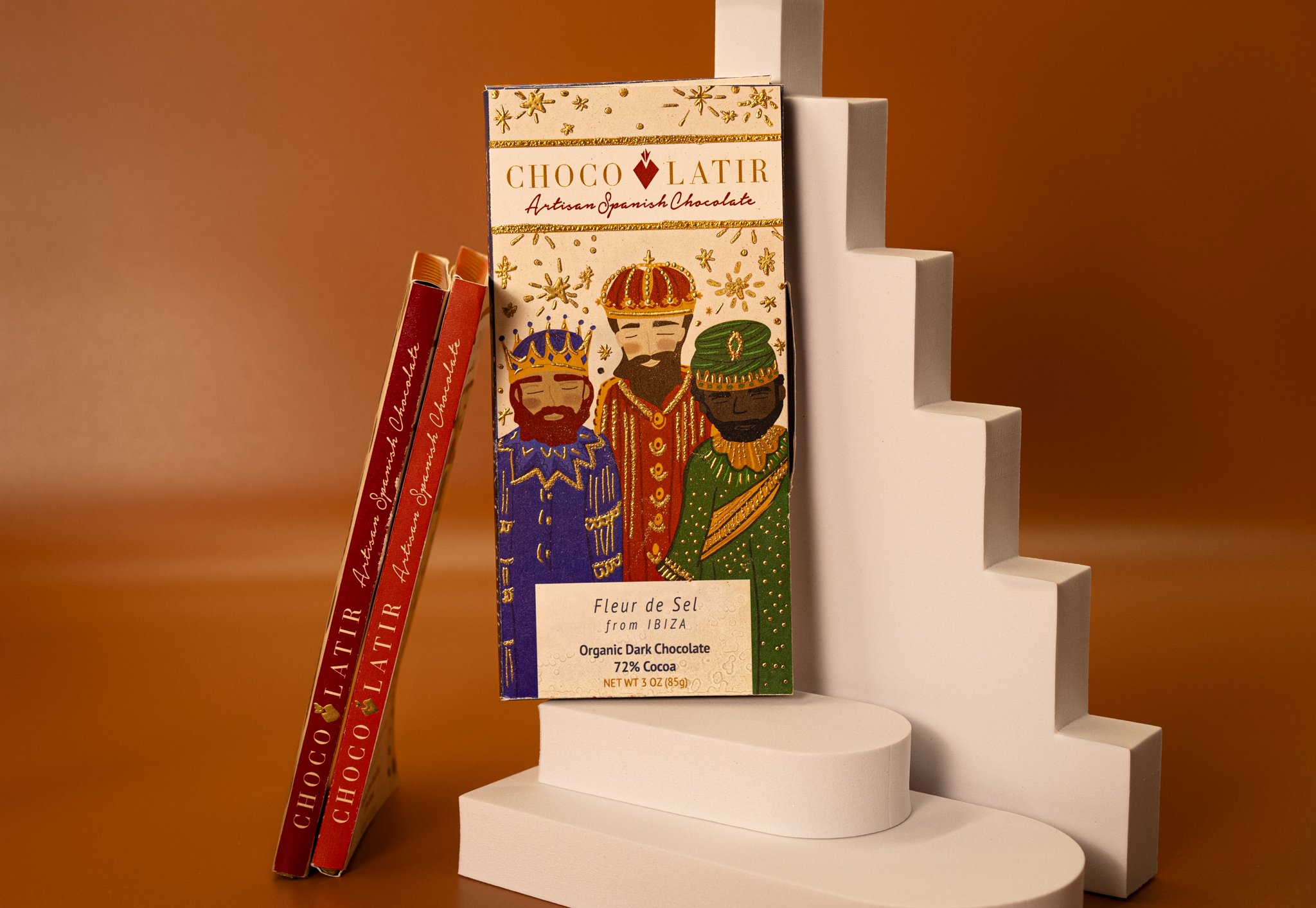
Reyes Magos

Fleur de Sel
COCOA HAZELNUT SPREAD JARS
For the spreads, I created two labels. Both of them with the same considerations and illustration but the size and information related to dimensions were different. These were easier to make, print and cut. I decided to use the crown as a graphic. I added a sticker to the cap of the bottles to make them more custom and personalized. I also looked for bottles that would match with their lids to my product and brand.


PREMIUM GOURMET COCOA POWDER
As another deliverable of my brand, I decided to create a pouch for cocoa powder. I got inspired by the shape of coffee packages. I decided to have one of the most significant traditions in this piece illustrated because I had the most space to show a more prominent illustration. I continued to present the ingredient in this package too. I draw cocoa beans and then added a gold accent with embossing too. La Fiesta de San Fermin is one of Spain’s most know festivities, so I opted to keep that simple and let the illustration and copy on the back be the main focus of the piece. The picture was inspired by an image from clipart, keeping the perspective but adding more elements and colors to be cohesive with the brand.

ASSORTED CHOCOLATE BOX
I looked at different boxes of chocolates for my assorted chocolate box and the way they display their information. I decided to make the logo the main point of the composition. Keep the brand’s elegancy and style and put the chocolates’ information inside in the back of the box. I used different colors and thickness on cardboard until I finally landed on the one used in my final composition